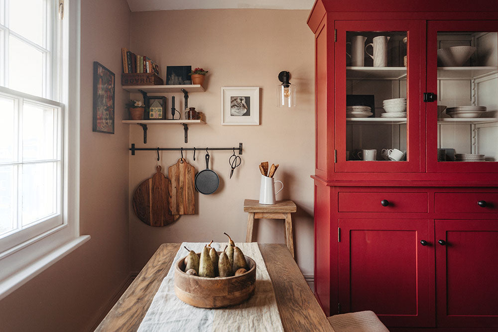
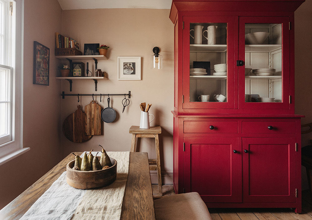
Our most recent photoshoot styled by Fliss and photographed by Rebecca Rees Photography features a beautifully inviting and atmospheric dining space. Here we share our thoughts on selecting colour schemes when decorating a space in your home.
Where to start
Our resident stylist Fliss suggests starting with an object or a key piece that will feature in the room. For example choose a painting that uses colours you love or a rug that will be the centre piece.
Also think about the sort feeling you wish to create in the space and choose colours that match this.
For our shoot we wanted to feature our new ironmongery finish
Aged Bronze, which is a dark rich colour. We decided to balance this with some lighter, brighter colours and so collected images that featured a dark, mid and pale colours. We also love Pantones colour of the year
Magenta.
Select & Try Colours
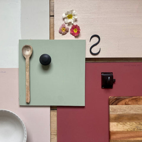
Now you have an idea of the sorts of colours you'd like to incorporate into your scheme pick up or order a range of paint colour cards and pick out some colours to try and buy some sample pots.
We recommend painting boards with your selected colours, this way you can position them in different parts of the room to see the colour in different light. Keep them out for 24 - 48 hours so you can view them at different times of the day.
'Work with 3 - 5 colours overall and remember colour can come from different elements; paint, plants, books, objects and so on' advises Fliss. 'Painting furniture in an accent colour is a great way to add some bold colour'
For our photoshoot we tried out a range of colours and considered them together;
Some Tips on Colour
- Choose complimentary colours for each colour to be showcased
- Create harmony with tones of the same colour
- Consider the positioning of colours in relation to natural light. South facing rooms have more scope with colour whereas north facing rooms benefit from warm colours
- Lighter colours make a space feel bigger and more open
- Darker colours give the perception that the wall (or ceiling) is closer than it is, great for making a space feel more cosy
- Highlight interesting details by painting moldings woodwork and windows in a contrasting colour.
- Add subtle depth by painting the ceiling and woodwork the same colour as the walls, one or two shades lighter and darker respectively
Styling
Our stylist Fliss suggests a few tips to create a natural looking space;
- Choose objects you love with colours that compliment your paint scheme
- Use pops of colour to lift the space and inject some fun, for example flowers, books, objects, which can all be easily changed to suit your mood or the season and change the space subtly
- Always use odd numbers and create triangles, this helps to draw the eye in and around the space
Our chosen colours from Farrow & Ball;