


Colourful Summer Styling
Take inspiration from our recent photoshoot here at Willow & Stone on how to use vibrant colour in your home.
When considering the styling, colour palette and theme of a photoshoot, much of this is centred around the products that we’re looking to capture, but I also love drawing inspiration from the seasons. I use the colour palette to link to the season visually, but I also want to evoke how the season makes you feel, while making sure that the products blend effortlessly with the scene.
As this was our summer shoot, I wanted to look for bold, lively colours that sit well in both a traditional and contemporary setting, whilst being sophisticated enough that they don’t overwhelm the space.
Choosing the right colours is so important – they can lift your mood and help create a space that feels comfortable, nurturing, or inspiring.
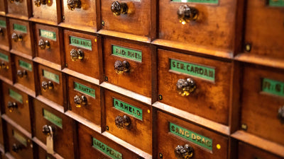
LAUNDRY ROOM
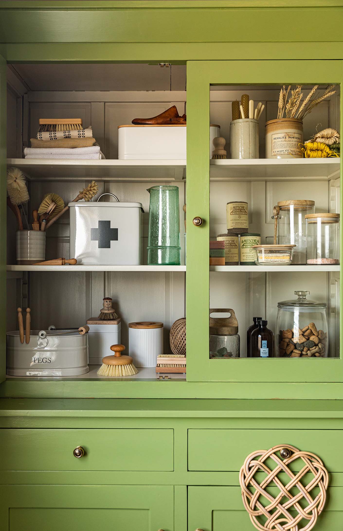
For the laundry room scene, I chose Yeabridge Green – a bright, rich green by Farrow & Ball. Laundry rooms are often associated with the mundane (storage, washing and endless piles of ironing!) so I wanted the colour choice to be lively to inject some energy and vibrancy into our household chores. The lovely yellow tones in this green really bring the colour alive.
I teamed the green with Shaded White for the interior of the cupboard – this neutral is incredibly versatile and pairs so well with the lush green. We have this colour on a few of the walls in our Falmouth shop and we absolutely love it!
To complete the setting, I painted the wall behind the unit in Farrow & Ball Drop Cloth. This mid-beige shade is neither too yellow nor too grey – a fantastic neutral that brings a little soul to a room and doesn’t feel dull. We shot this scene right next to a window looking out over Falmouth Harbour, so we had plenty of natural light, but for shadier rooms I’d recommend opting for Shaded White on both the walls and interiors of units for more of a lift.
Painting a piece of furniture is one of my favourite ways to bring colour into a room without overwhelming the space (this is a great option for smaller rooms). Choose a colour that features in textiles or a painting in the room to complement the existing palette.
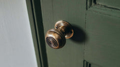
For the fittings I went with one of our all-time favourites (and bestseller throughout the years), the Aged Brass Bloxwich Cabinet Knobs in both Small and Large sizes. The golden hue of the Polished Aged Brass adds the perfect finishing touch to the green unit, but really any of our brass finishes would look beautiful with this colour (my other top picks were the Queen Anne Cabinet Knobs, Regency Pull Handles and Large Curved Hooded Pulls).
KITCHEN
For the kitchen I chose a rich Mediterranean mid-blue (Princeton Blue by Valspar) which for me evokes memories of holidays abroad, painted shutters on house fronts and enjoying long dinners outside with family. This is another lovely, sophisticated tone that’s not too harsh or bright, but just the right level of bold to work in both traditional and contemporary homes.
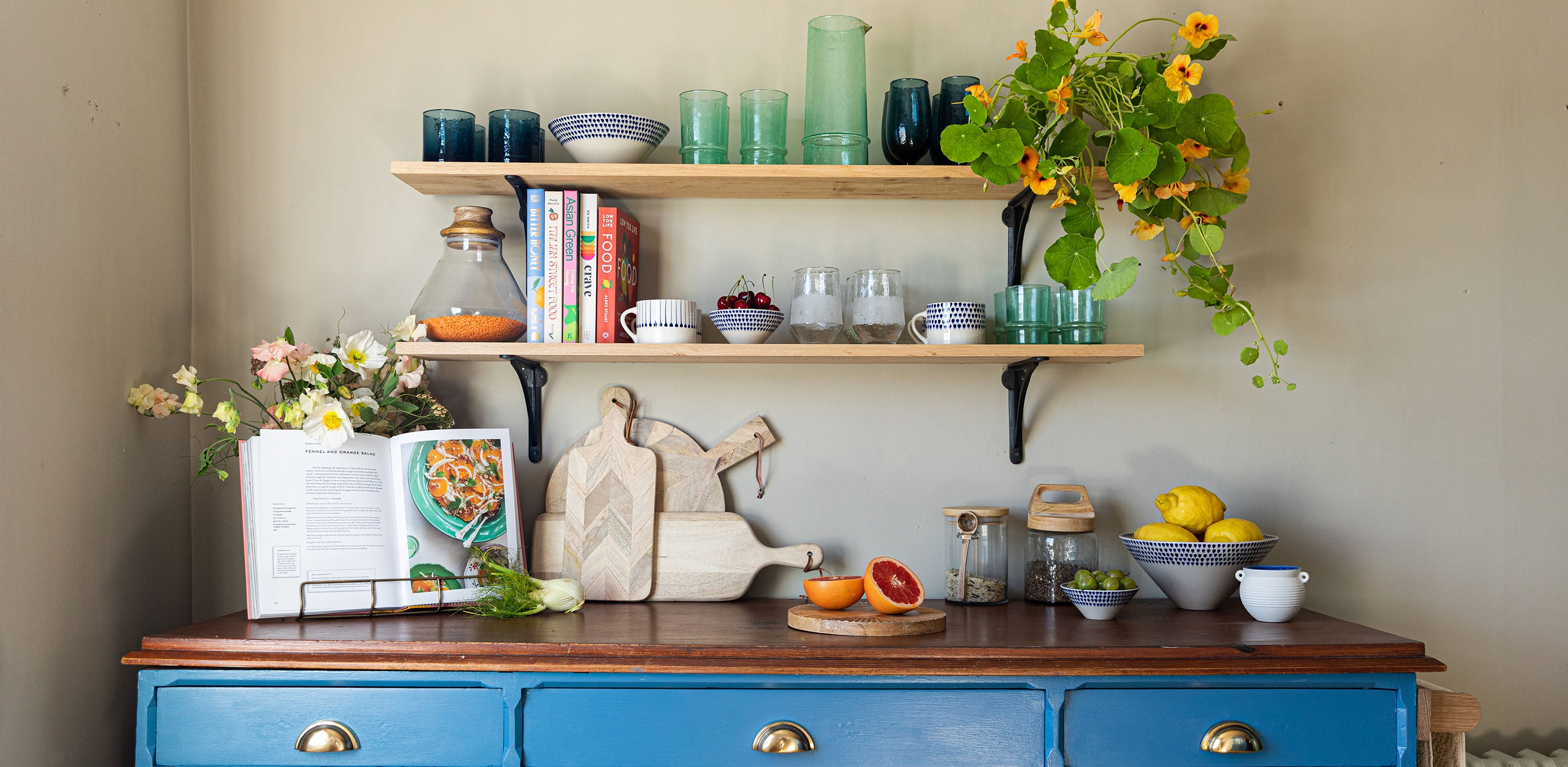
This blue looks fantastic with the small pops of orange and green from the foliage and kitchen items I included in the scene, and works extremely well with the darker wood worktop. Orange as a colour choice on its own can be overwhelming, but when used in small quantities it complements and enhances many other colours.
If you’d like to use a bright colour like this in your home but aren’t sure how to include it without looking garish, a floral fabric or patterned wallpaper is a great place to start. I love Magnolia Linen Fabric, Morris & Co Wallpaper and Cole & Son Wallpaper.
LIVING ROOM
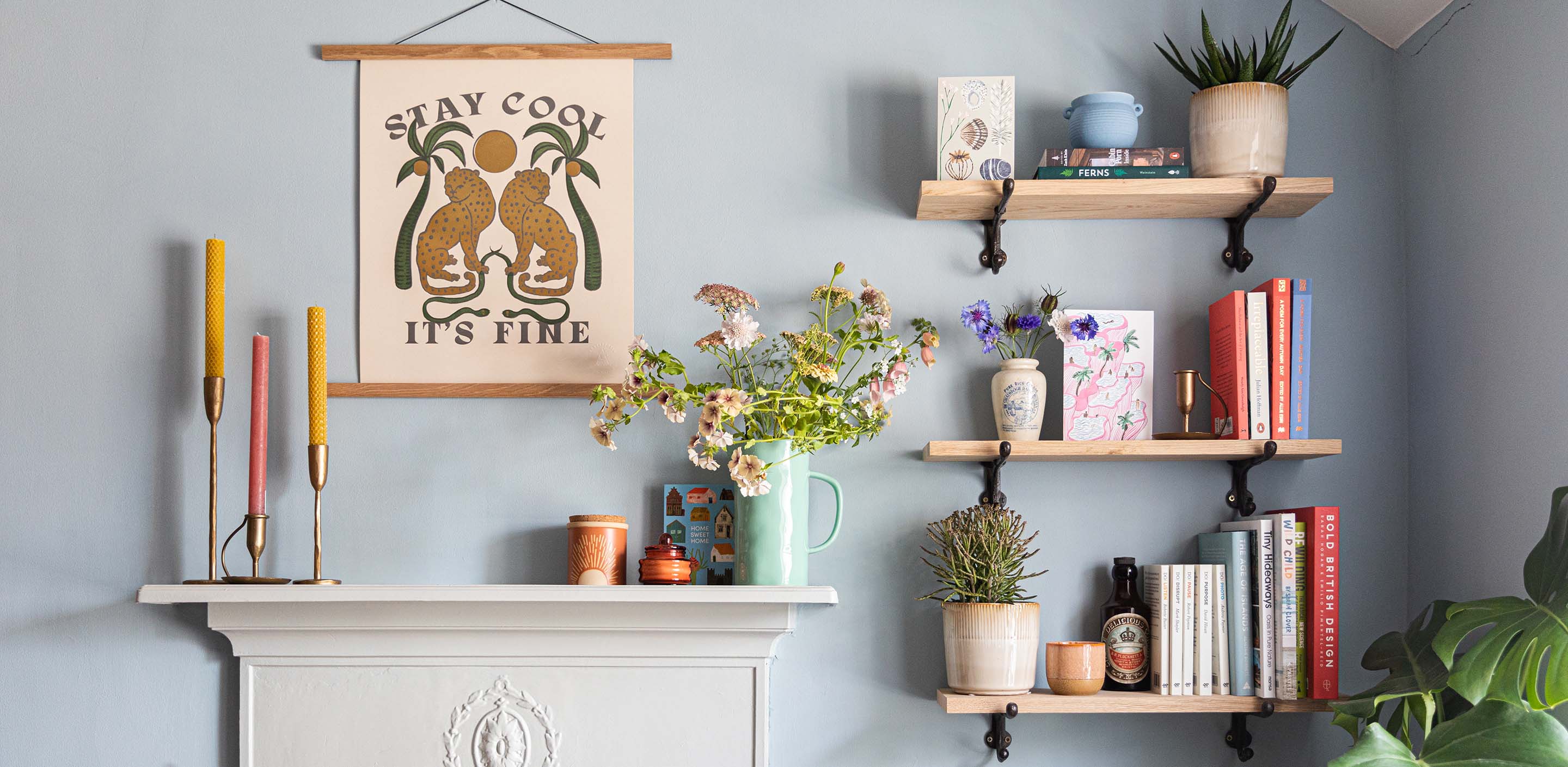
For this room I chose a fresh, calm colour palette and used the homewares to add texture and warmth with pops of accent colours. We painted the walls in Hazy, another Farrow & Ball Colour.
This blue was a great foundation for the pops of coral orange, mustard yellow and soft greens and pinks in the featured products.
The colour palette for this room was more subtle than the others, as I wanted the background to enhance the colourful products, rather than fight against them. I was inspired by the soft blanket that we draped across the rattan chair and picked out the grey blue that ran through the pattern. I was drawn to Hazy for the walls as this shade of blue has enough grey to move it away from a baby
blue shade into something more sophisticated. I thought this colour also paired really well with the bright blue I chose for the kitchen and the rich green for the laundry room, resulting in a cohesive palette of shades that looked great together or on their own.